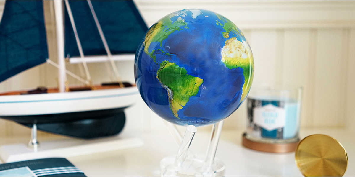
With daylight lingering around longer and spring creeping up around the corner, we have another invigorating color to share with you. Whereas seafoam from our last color spotlight evokes the feeling of going to the beach, snorkel blue (part of Pantone’s Spring 2016 Color Report) is a vivid, bouncy shade that reminds us of spring escapes and relaxing vacations. TheEarth MOVA Globe features Snorkel blue in shaded reliefs, adding a nautical feel and world-trotting spirit to any interior. The color is energetic yet still, and like its namesake, makes you want to take a dip in the water and venture into the deep blue. We recommend pairing it with a bright gold shade and coffee wood, along with other nautical trinkets to create a carefree space.
How are you using snorkel blue in your lifestyle? Let us know on Facebook!